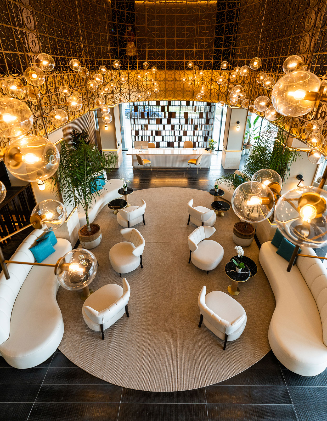
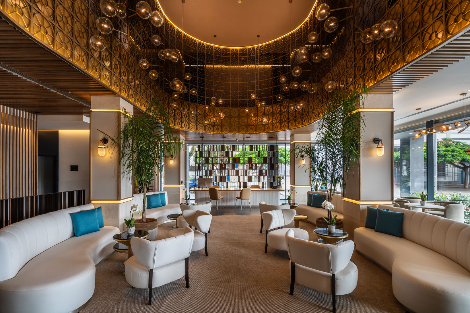
M: How does the essence of the island that you mentioned fit in with the selection of the interior design tones?
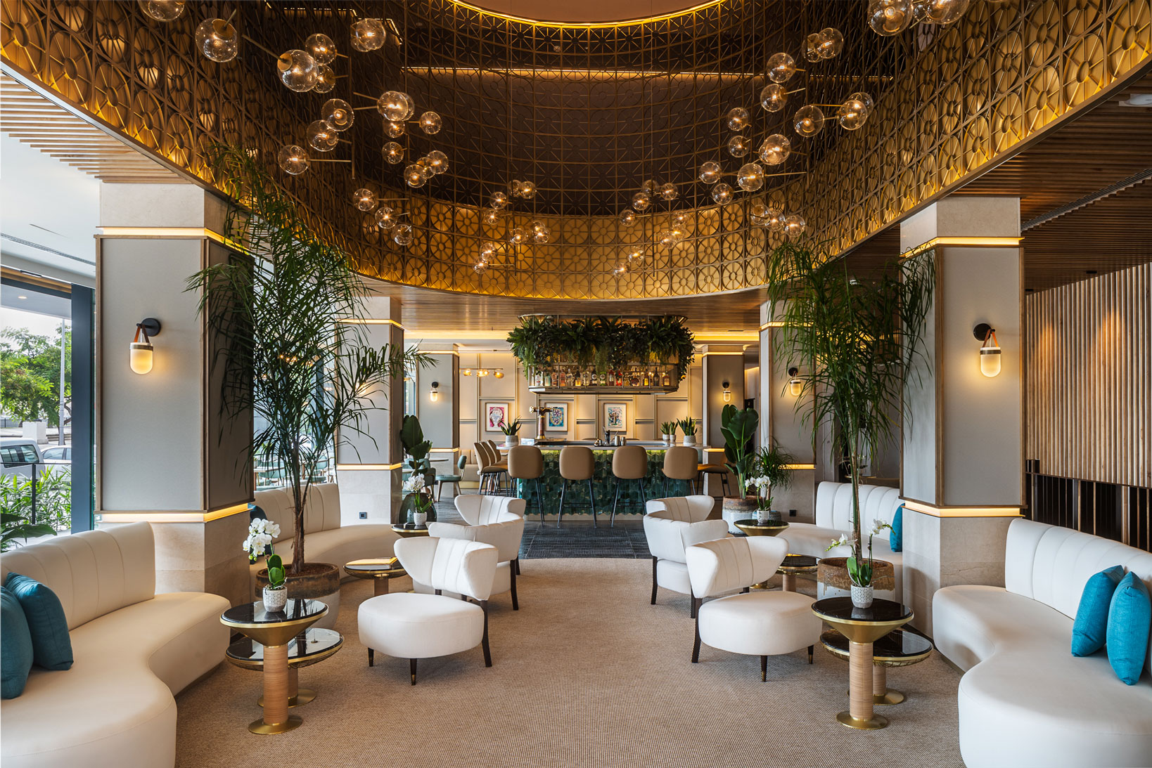
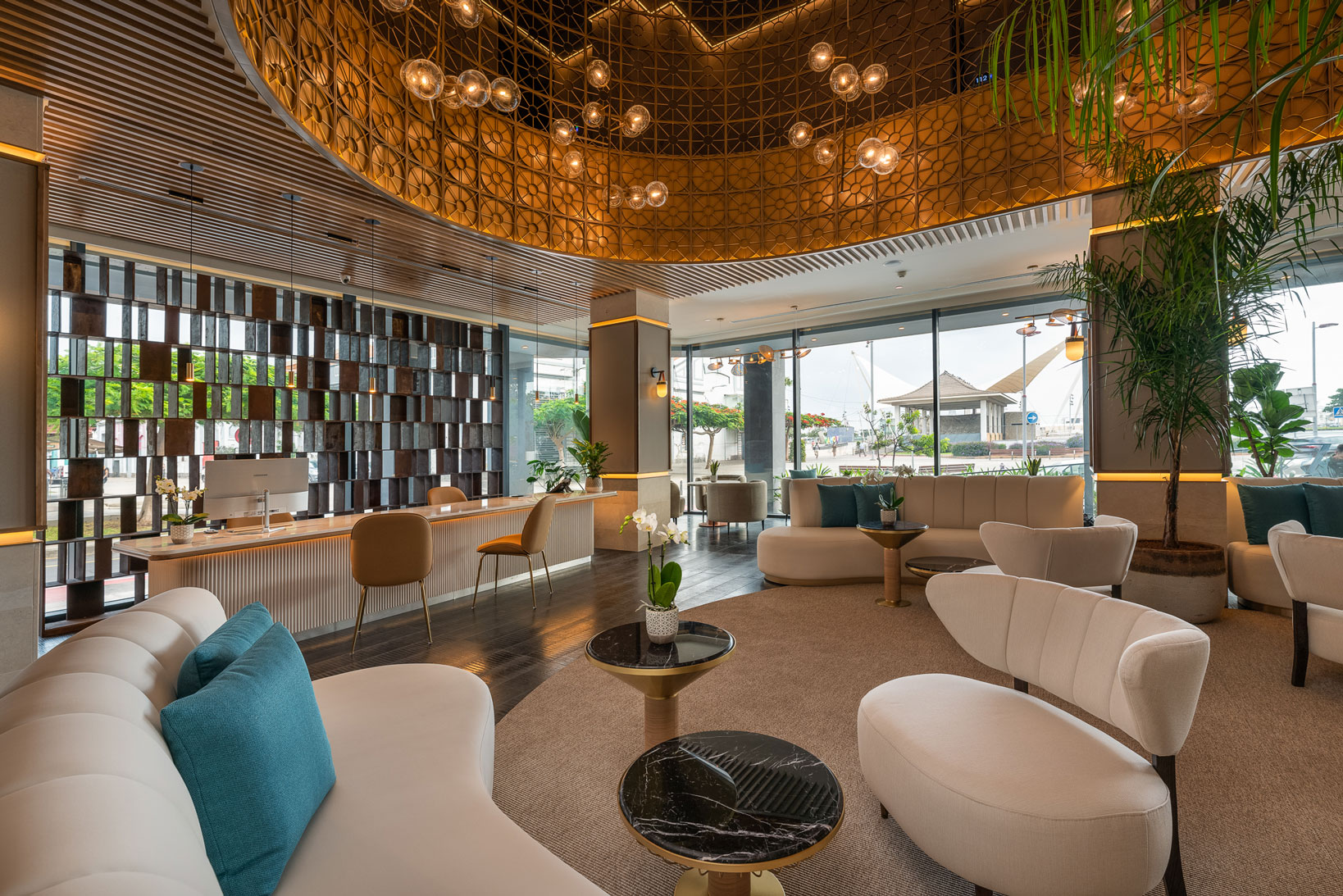
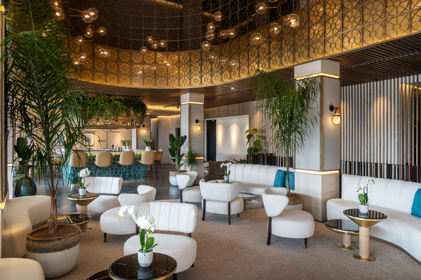
EM: I wanted to use textures and colours of the earth, sand and lava, next to the sea, without being overly obvious, but giving a few light native touches. In addition, I wanted a pleasant atmosphere that neutral or beige tones provide me with.
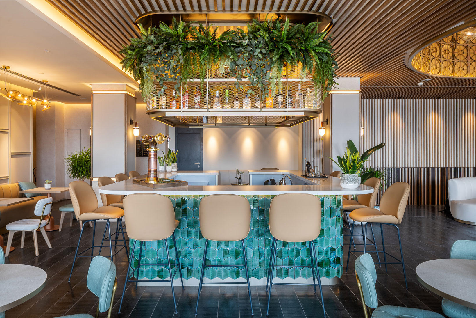
In the upholstery, I allude to the blue of the sea, that intense colour that we see in the Canary Islands, of deep seas. In the bar we have this play of blues and greens again, with the movement provided by the handmade material, which gives personality and closeness to the space.
M: How do you achieve a luxury 70s interior?
EM: This building is original from the 70s and on this base we applied gold, with geometric shapes reminiscent of those years. The screen stands out, inspired by the aesthetics of those years, of the original building, as a reminiscence of its history.


