M: To achieve this wellness feel, how have you worked with the colour palette in the layout, the intention of each area and its functionality in the space?
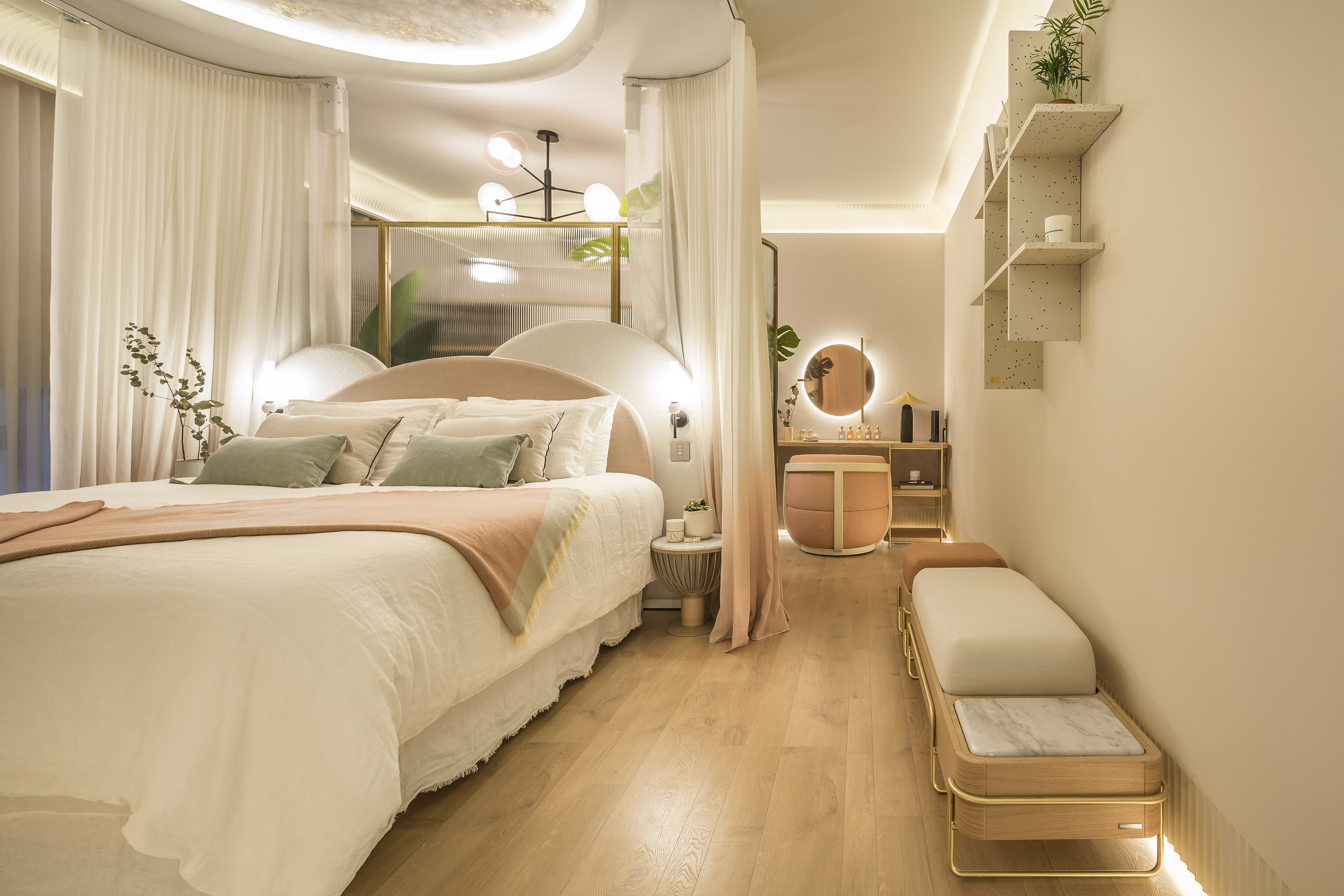
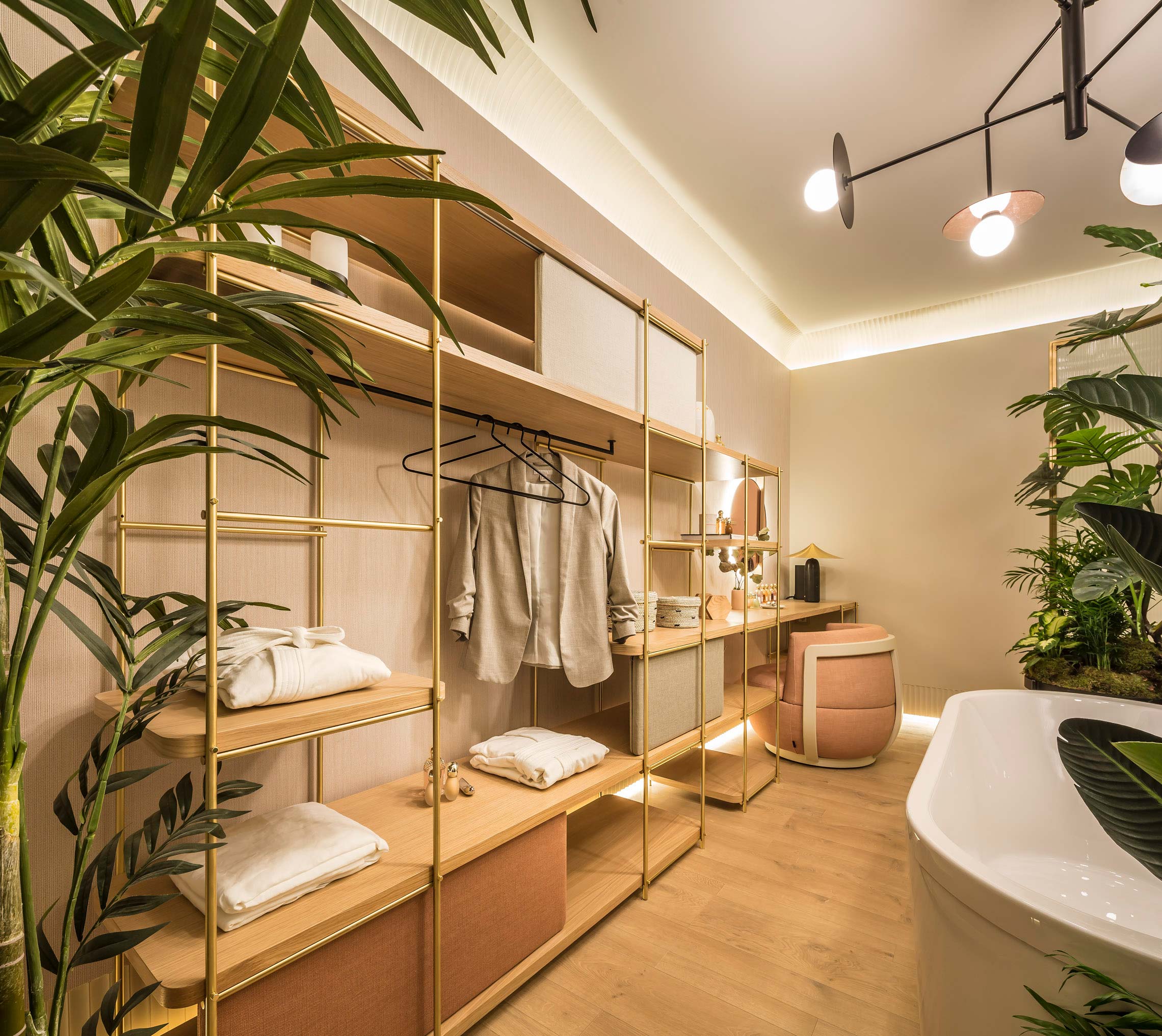
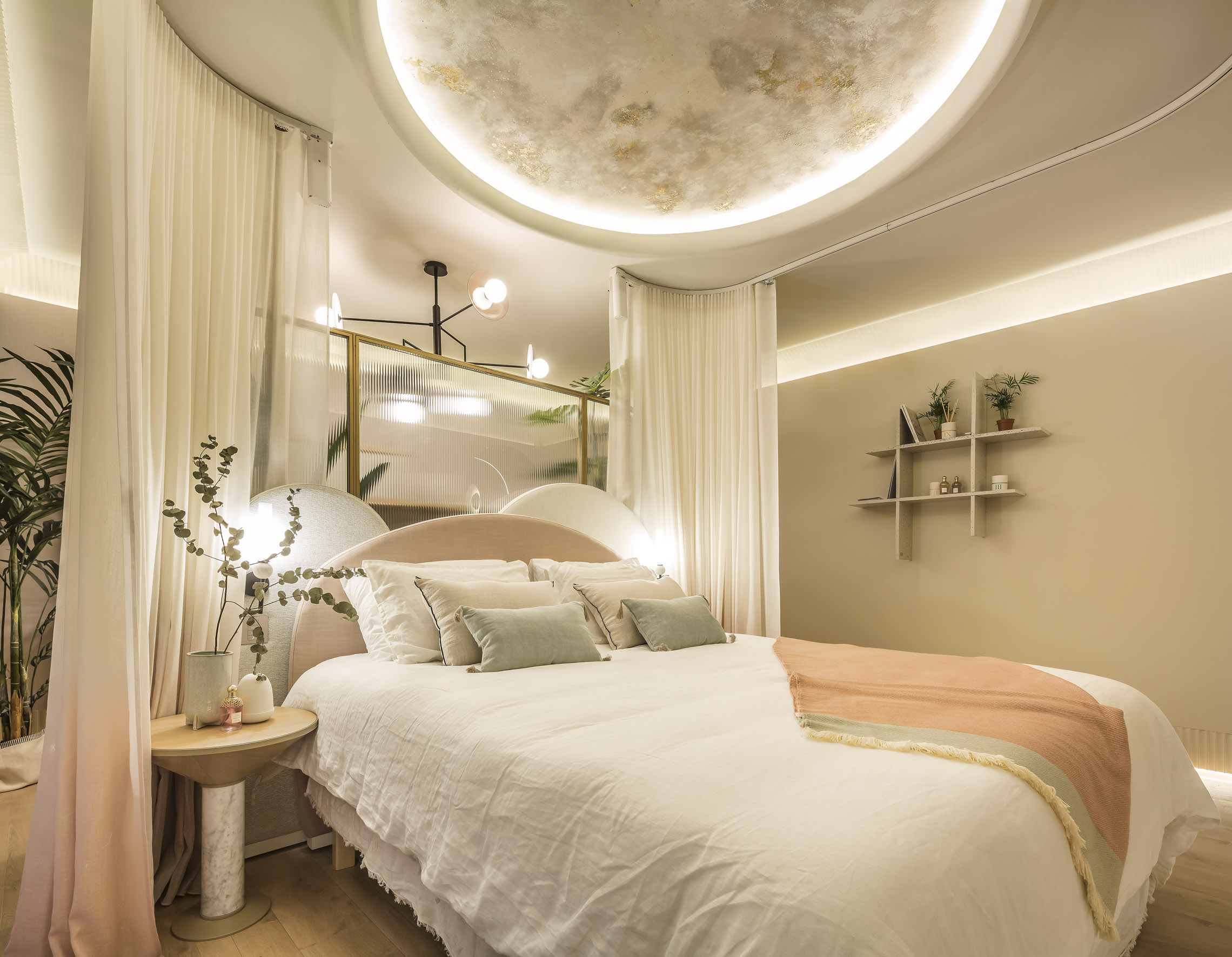
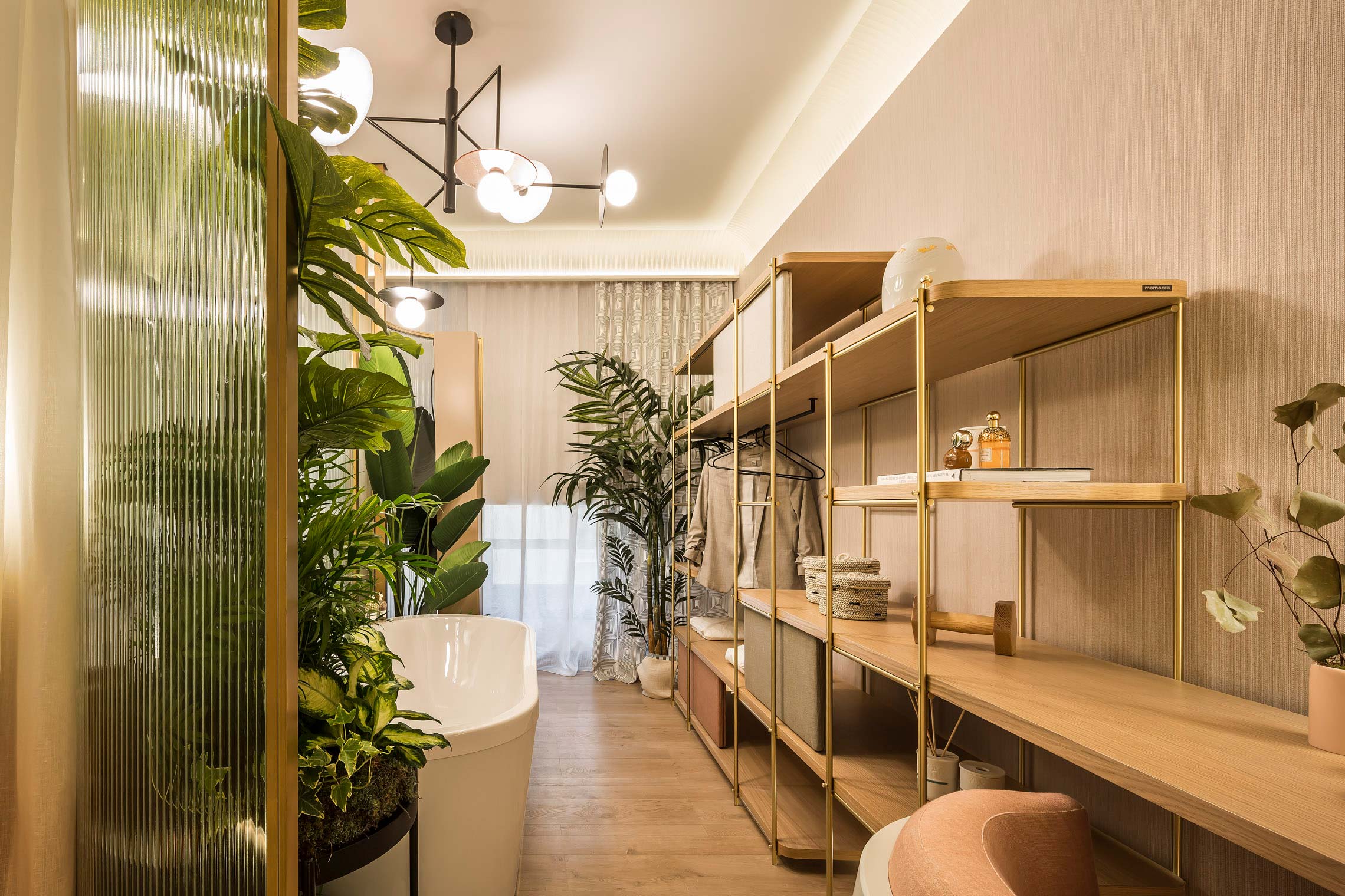
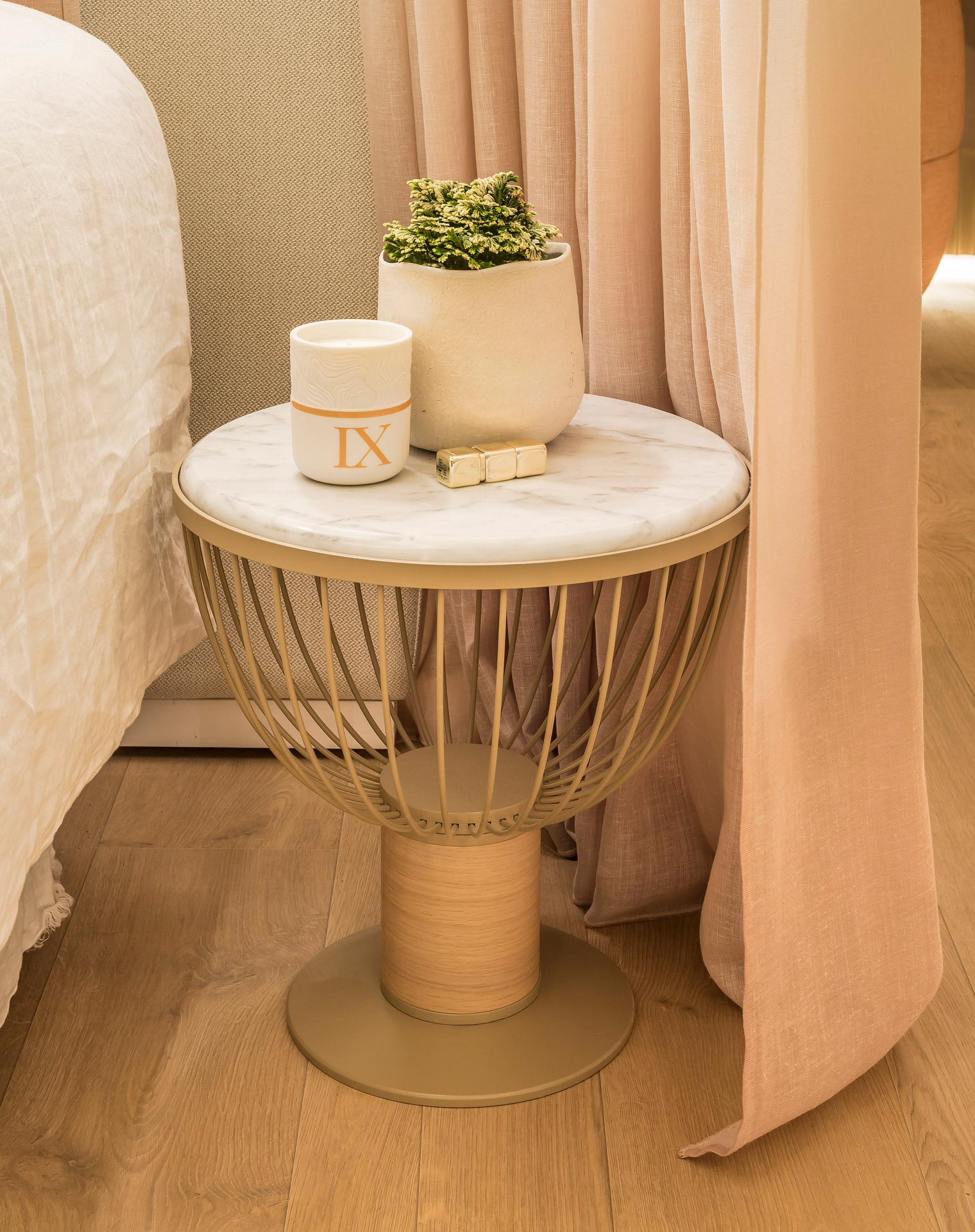
UI: The chosen colour palette is based on the earthy and natural, giving those touches of pink, which has properties to heal pain and sadness, which restores youth and favours reflection and meditation. It is a concept of relaxing colours that help you connect with nature and yourself.
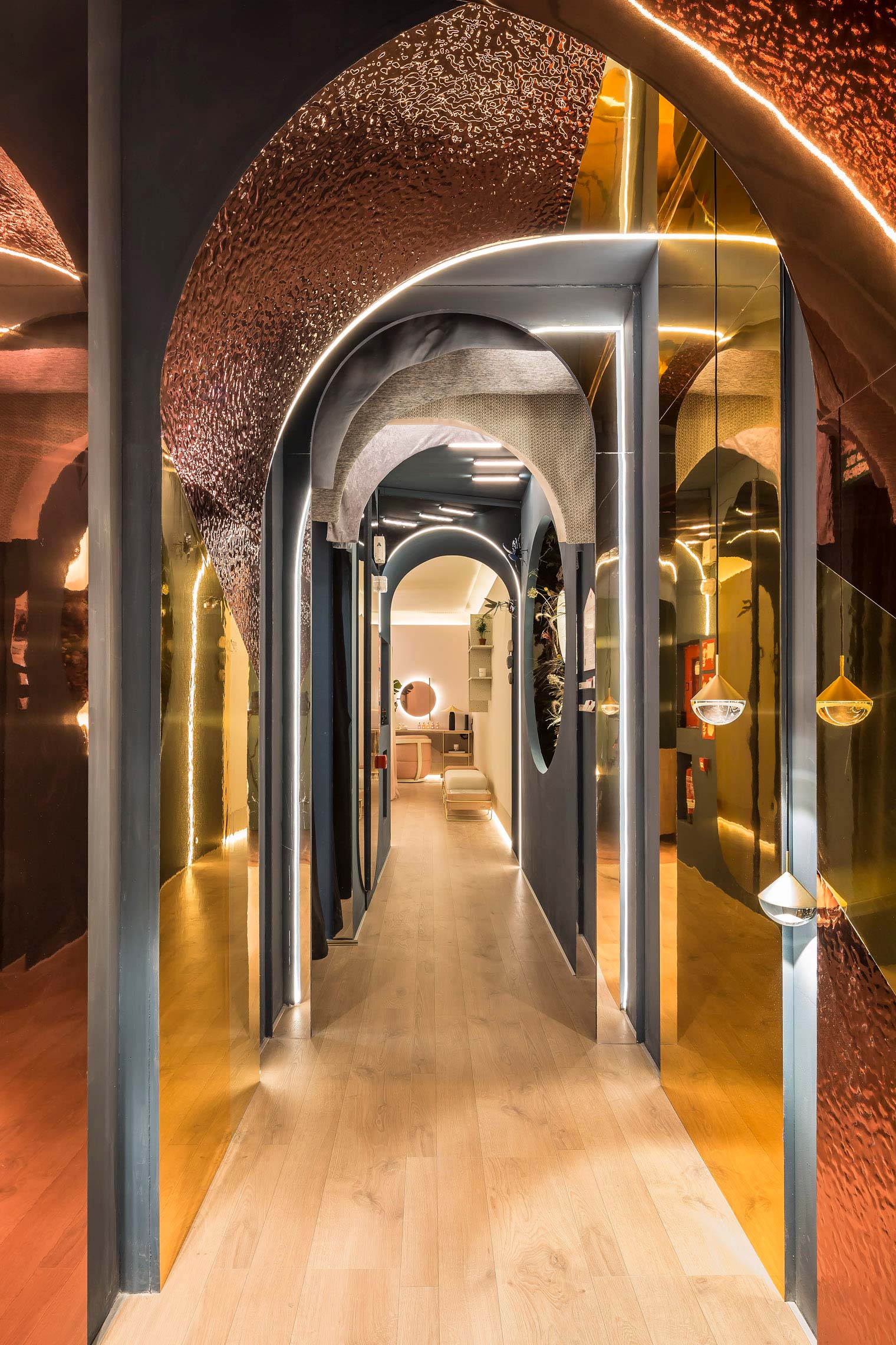
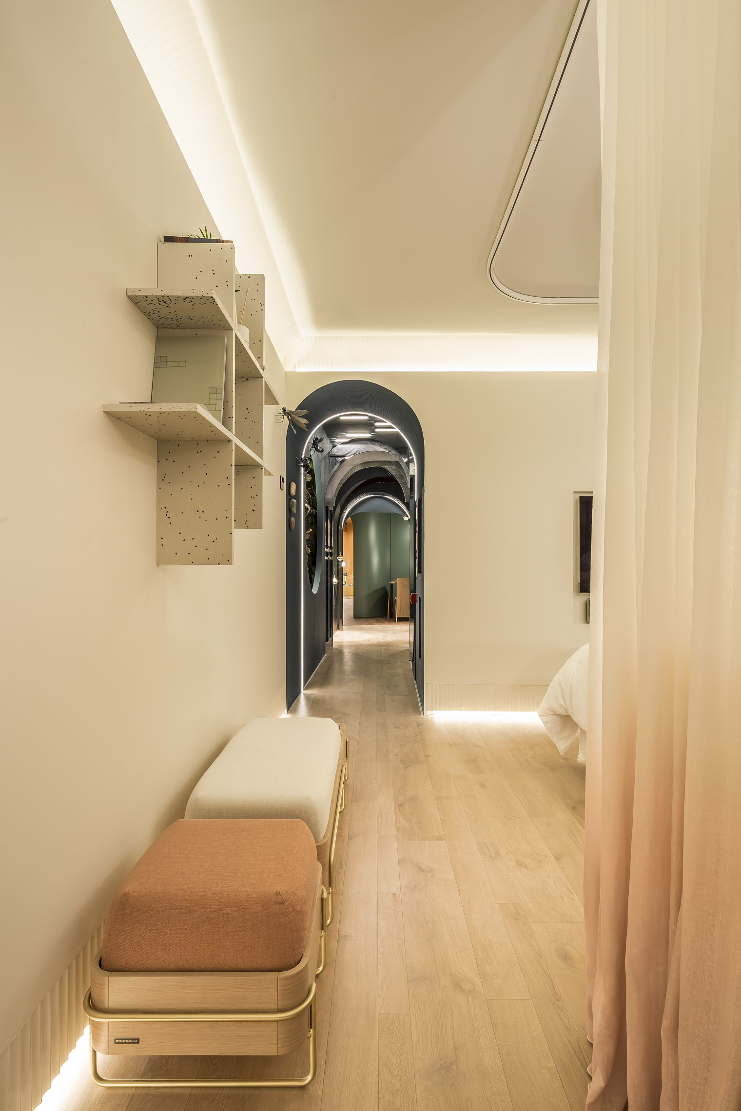
Our space is divided into two very distinct areas, the corridor, and the bedroom. The corridor is the reflection of what we live day by day and the room is our wellness corner, divided into several areas:
Sleeping area, where the bed is. The idea is that to sleep, you arrive, close yourself and relax looking at the artwork that is inspired by three volatile elements and precious moments that nature gives us: pink skies, intertwined clouds, and the full moon.
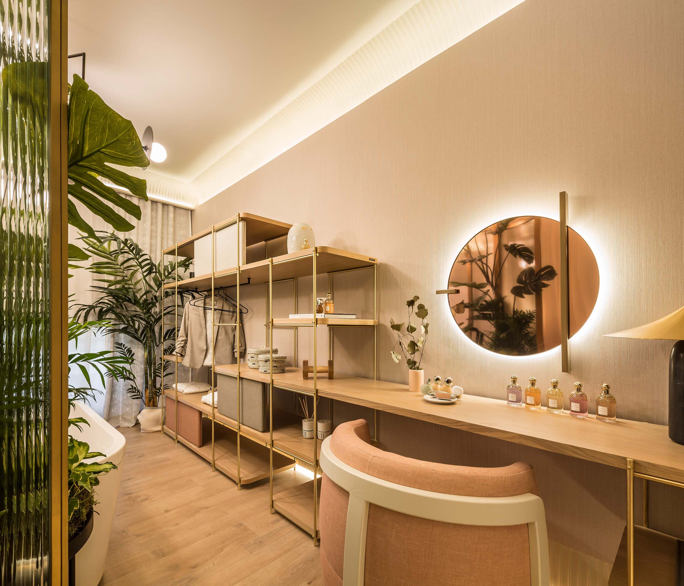
Behind this is the wellness area with the dressing table and dressing room, the bathtub, in which you can take a relaxing bath surrounded by nature. Finally, next to the window, we have the fitness area for meditation and yoga.


